Colleges
- American Athletic
- Atlantic Coast
- Big 12
- Big East
- Big Ten
- Colonial
- Conference USA
- Independents (FBS)
- Junior College
- Mountain West
- Northeast
- Pac-12
- Patriot League
- Pioneer League
- Southeastern
- Sun Belt
- Army
- Charlotte
- East Carolina
- Florida Atlantic
- Memphis
- Navy
- North Texas
- Rice
- South Florida
- Temple
- Tulane
- Tulsa
- UAB
- UTSA
- Boston College
- California
- Clemson
- Duke
- Florida State
- Georgia Tech
- Louisville
- Miami (FL)
- North Carolina
- North Carolina State
- Pittsburgh
- Southern Methodist
- Stanford
- Syracuse
- Virginia
- Virginia Tech
- Wake Forest
- Arizona
- Arizona State
- Baylor
- Brigham Young
- Cincinnati
- Colorado
- Houston
- Iowa State
- Kansas
- Kansas State
- Oklahoma State
- TCU
- Texas Tech
- UCF
- Utah
- West Virginia
- Illinois
- Indiana
- Iowa
- Maryland
- Michigan
- Michigan State
- Minnesota
- Nebraska
- Northwestern
- Ohio State
- Oregon
- Penn State
- Purdue
- Rutgers
- UCLA
- USC
- Washington
- Wisconsin
High Schools
- Illinois HS Sports
- Indiana HS Sports
- Iowa HS Sports
- Kansas HS Sports
- Michigan HS Sports
- Minnesota HS Sports
- Missouri HS Sports
- Nebraska HS Sports
- Oklahoma HS Sports
- Texas HS Hoops
- Texas HS Sports
- Wisconsin HS Sports
- Cincinnati HS Sports
- Delaware
- Maryland HS Sports
- New Jersey HS Hoops
- New Jersey HS Sports
- NYC HS Hoops
- Ohio HS Sports
- Pennsylvania HS Sports
- Virginia HS Sports
- West Virginia HS Sports
ADVERTISEMENT
You are using an out of date browser. It may not display this or other websites correctly.
You should upgrade or use an alternative browser.
You should upgrade or use an alternative browser.
New White Helmet
- Thread starter BigTimeAt69
- Start date
Things I like
White looks pretty cool and clean
Number on the side. All of purdue's logos would look stupid if they are on both sides they aren't perfectly symmetrical.
The color of the gold. Love the metallic gold stripe
The gold going down the facemask is new and interesting.
White in the hot fall months will be a god send compared to the black we normally wear. I mean really we wear black and let the away team wear light color uni that's got to be a fatigue disadvantage.
I would have put the purdue boilermaker on the front and a black or gold P on the side.
Other thoughts. I think a cool graphic type helmet could incorporate a big boilermaker at the front with billowing smoke.
What's wrong with this look? Cool and classy - and it actually uses our school colors...


Yeah, but they should step away from the P sometimes. Agree the train logo was poorly chosen. It will look complicated and unrecognizable from far away.
My favorite will always be the griffin. A hammer logo would have been cool. I loved someones suggestion of having a steam/smoke helmet with the grey jerseys. That would have been awesome. Personally, I would have given this white helmet a black stripe and colored the entire train side with that gold with no logo.
No offense, but if one is saying "Whats wrong with these unis...", youre undoubtedly really old or at least not forward thinking from a style perspective. Theres nothing wrong with that, but youre never going to unite the masses like that.
Although, I would love to see some throwback unis every couple years.
Theres nothing wrong with that, but youre never going to unite the masses like that.
Oh wise one with thinking like that YOU are never going to unite the masses. The closest Purdue will get to "uniting the masses" is if/when they put a consistent winning team on the field then the masses will unite even if they put them in ugly grey sweats. It's not the unis that will excite/unite the masses it's a winning program. None of the other crap has the staying power of a winning team. Oh, yes I'm reaallllllyyyy old but I still can remember a couple of periods where Purdue was solid and it wasn't because Phil Knight put them in fluorescent unis.
Oh wise one with thinking like that YOU are never going to unite the masses.
Hahaha.
Youre right winning has the first and foremost impact. I dont think anyone has ever debated that... ever. What points like that miss is the added help of appearing cool to younger fans and recruits for non-pedigree programs. I barely follow recruiting and have noticed, ridiculously so imo, that recruits base a non-trivial portion of their commitment on uni provider and the sharpness of uniforms.
Do you want this to work for or against Purdue? And no, its not at the expense of tradition. The grey unis are for a game. The white helmets are for a max of 1-3 weeks? Nor does Purdue have tradition of much. QBs, some D linemen, and average football.
Not to mention that Phil Knight built Oregon more through facilities than unis.
Im not calling people old as an insult. Im saying they are old because its relevant. Those fans/alumini are going to stereotypically desire no change for the sake of no change. In the current environment, this would detrimentally impact the team. I dont like the white helmet or grey uni because of how they look. I like them because they address a need.
Or this one? I messed up the neck though. It should be white at the point and not gold. I like the jerseys but not the pants, btw.


These would set us back look wise literally 15 years if not moreOr this one? I messed up the neck though. It should be white at the point and not gold. I like the jerseys but not the pants, btw.

We should go for them then. Since our team is already more than 15 years behind where they should be the look would match the product!!!These would set us back look wise literally 15 years if not more
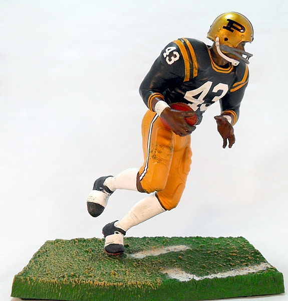
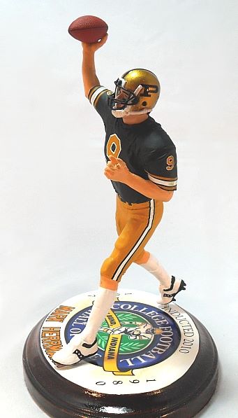
TMA, where did you get those? Assuming they're something you own...
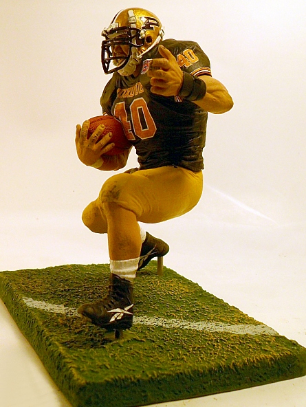
Housedaddy, I found them one here. Someone has painted up many of the iconic team players including Purdue. Very Impressive!
http://www.sportsattic2.com/McFarlane/purdue.htm
Housedaddy, I found them one here. Someone has painted up many of the iconic team players including Purdue. Very Impressive!
http://www.sportsattic2.com/McFarlane/purdue.htm
Wow. Those are freaking sweet.
You do realize that all of the past unis you just used as examples of "sticking to a classic" were all different, right? Slanted P vs block P, stripes vs no stripes, different shades of gold, "Purdue" written on the uni vs plain uni, different stripes on the helmets, etc. Unis change all of the time. The whole traditionalists stand on keeping the "old" unis has no merit. I love the white helmet. I just wish I knew where I could buy this helmet along with the other alternative ones over the last few years.
Purdue's school colors are Old Gold and Black. Period. Nothing wrong in using variations of the older "classic" unis. However, WHITE is not a school color and should not be used. Its hard to create or maintain an "image" at Purdue when they try there best to impersonate a chameleon. Especially when they are using colors that are not even associated with the school.
White should NEVER be used? White was in your "classic" unis. Its almost always been in our unis. What "image" are we trying to create or maintain? Every school has alternate unis. Is our "image" one of a 78 year old man screaming "get off my lawn!"?
I think that for me it just goes back to not liking the reinvention of the train that Nike did to try to make it symmetrical so it was easier to put on shit. It just looks horrible and we really have no say in the matter.
Similar threads
- Replies
- 17
- Views
- 2K
- Replies
- 2
- Views
- 241
- Replies
- 14
- Views
- 2K
Purdue women's basketball Reynolds sisters looking new new homes
- Replies
- 0
- Views
- 369
ADVERTISEMENT
ADVERTISEMENT


