

Colleges
- AAC
- ACC
- Big 12
- Big East
- Big Ten
- Pac-12
- SEC
- Atlantic 10
- Conference USA
- Independents
- Junior College
- Mountain West
- Sun Belt
- MAC
- More
- Navy
- UAB
- Tulsa
- UTSA
- Charlotte
- Florida Atlantic
- Temple
- Rice
- East Carolina
- USF
- SMU
- North Texas
- Tulane
- Memphis
- Miami
- Louisville
- Virginia
- Syracuse
- Wake Forest
- Duke
- Boston College
- Virginia Tech
- Georgia Tech
- Pittsburgh
- North Carolina
- North Carolina State
- Clemson
- Florida State
- Cincinnati
- BYU
- Houston
- Iowa State
- Kansas State
- Kansas
- Texas
- Oklahoma State
- TCU
- Texas Tech
- Baylor
- Oklahoma
- UCF
- West Virginia
- Wisconsin
- Penn State
- Ohio State
- Purdue
- Minnesota
- Iowa
- Nebraska
- Illinois
- Indiana
- Rutgers
- Michigan State
- Maryland
- Michigan
- Northwestern
- Arizona State
- Oregon State
- UCLA
- Colorado
- Stanford
- Oregon
- Arizona
- California
- Washington
- USC
- Utah
- Washington State
- Texas A&M
- Auburn
- Mississippi State
- Kentucky
- South Carolina
- Arkansas
- Florida
- Missouri
- Ole Miss
- Alabama
- LSU
- Georgia
- Vanderbilt
- Tennessee
- Louisiana Tech
- New Mexico State
- Middle Tennessee
- Western Kentucky
- UTEP
- Florida International University
High School
- West
- Midwest
- Northeast
- Southeast
- Other
- Alaska
- Arizona
- California
- Colorado
- Nevada
- New Mexico
- Northern California
- Oregon
- Southern California Preps
- Washington
- Edgy Tim
- Indiana
- Kansas
- Nebraska
- Iowa
- Michigan
- Minnesota
- Missouri
- Oklahoma Varsity
- Texas Basketball
- Texas
- Wisconsin
- Delaware
- Maryland
- New Jersey Basketball
- New Jersey
- New York City Basketball
- Ohio
- Pennsylvania
- Greater Cincinnati
- Virginia
- West Virginia Preps
ADVERTISEMENT
Install the app
How to install the app on iOS
Follow along with the video below to see how to install our site as a web app on your home screen.
Note: This feature may not be available in some browsers.
You are using an out of date browser. It may not display this or other websites correctly.
You should upgrade or use an alternative browser.
You should upgrade or use an alternative browser.
New White Helmet
- Thread starter BigTimeAt69
- Start date
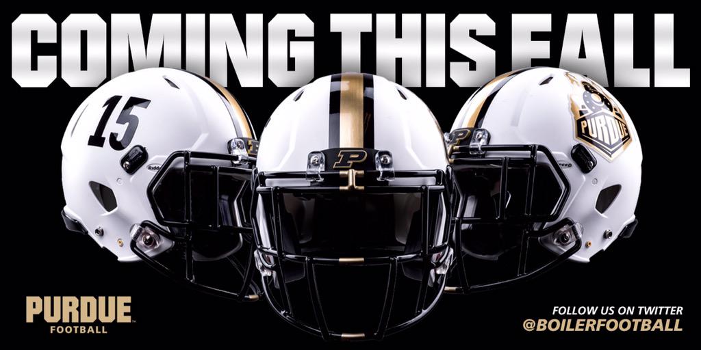

thought i saw kugler w/one.
not bad i guess, but watching on tv there's no way to discern our current train logo on it.
a giant version of it (like boise st or something), or just the motion P would have been far more visible.
guess that explains the white-out football posters/pics, and white lettering on the field.
good for the guys wearing white jerseys in the early hot summer games (assuming that's what we do), but i much prefer black as purdue's primary color.
so many other teams have stolen black as a color, and now we're going away from it!
This post was edited on 4/18 2:09 PM by BoilerBiker
Originally posted by BoilerBiker:
thought i saw kugler w/one.
not bad i guess, but watching on tv there's no way to discern our current train logo on it.
a giant version of it (like boise st or something), or just the motion P would have been far more visible.
guess that explains the white-out football posters/pics, and white lettering on the field.
good for the guys wearing white jerseys in the early hot summer games (assuming that's what we do), but i much prefer black as purdue's primary color.
so many other teams have stolen black as a color, and now we're going away from it!
This post was edited on 4/18 2:09 PM by BoilerBiker
I bet we aren't going away from it, I think we are just adding options to the uniform selection. And like you said it's good for the early hot games. I bet these are worn in September and early October and road games. As soon as it isn't horrible to wear black due to the heat, I bet/hope we go to the mat black helmets.
Posted from Rivals Mobile
I'm usually in the "forget the new uniform gimmick" camp, but I gotta admit, I kinda like 'em...
Posted from Rivals Mobile
Posted from Rivals Mobile
Fine I'm an old guy but...
So now our colors are white and...grey...or what?
Hate 'em.
FWIW my 15 year old's feedback was: yuck
I don't get why we are getting away from all things gold and black - 2 of the coolest colors in college football.
Indications of a program completely floundering for an identity.
Oh well back to my cave...
I am an old guy too, been watching Purdue Football and Basketball in person and later when I moved away from Indiana on TV or the internet since the early '60's,
I like them but I agree with the train logo being hard to see. I wish they would look at putting the slant P in the new gold color as the stripe outlined in the black color on the side and then stop the middle stripe towards the back so that a a train logo would fit there! It's a thought and decals are rather inexpensive so they should look at some additional options to the white helmet, they have plenty of time to get it right!
I like them but I agree with the train logo being hard to see. I wish they would look at putting the slant P in the new gold color as the stripe outlined in the black color on the side and then stop the middle stripe towards the back so that a a train logo would fit there! It's a thought and decals are rather inexpensive so they should look at some additional options to the white helmet, they have plenty of time to get it right!
NCAA has no white home rule as the high school's do for basketball Yellow or gold is an acceptable home color in the NCAA but a no-no in high school games. Yellow or gold may be an away color for high schools though! The NCAA rule on color I believe is up to the home school and/or an agreement with the two schools in a contest, I believe!
I kinda like them. I've always liked the Steelers' "unbalanced helmet" design, so I guess that's probably why I like the numbers on one side & the logo on the other. I do wish the railroad track design was used on the stripe...I really like that as a unique, Purdue design element.
To add to the alternate uni info, as an out-of-stater in B1G country, I got more texts (good & bad) from non-PU friends about the "highlighter" cancer awareness jerseys/helmets than about any other specific PU football item in the last 4 or 5 years.
To add to the alternate uni info, as an out-of-stater in B1G country, I got more texts (good & bad) from non-PU friends about the "highlighter" cancer awareness jerseys/helmets than about any other specific PU football item in the last 4 or 5 years.
OSU home unis: Red jerseys, grey pants
Michigan home unis: Blue jerseys, yellow pants
Iowa home unis: black jerseys, yellow pants
PSU home unis: blue jerseys, white pants
MSU home unis: green jerseys, white pants
Wisky home unis: red jerseys, white pants.
Etc, etc, etc.
PU home unis: white jerseys, white pants, now white helmets.
A completely no-descript, unidentifiable look.
But it really makes no difference - and pretty much sums up the ID of the program right now.
Purdue FB has regressed to the point we are now what IU was. Depending on glitchy uni changes and fluff on the sidelines to keep attention away from the product on the field. Traditional power schools don't do this crap. They have and identity and are proud of it. Not so much with Boilers. Next thing you know our helmets will say "Makers All" on them.
I think the new staff thinks it is necessary...
The uniform combinations, the new helmet, the request for turf... The staff thinks that the lack of those things is why our recruiting is down. And they are "easy" fixes to maybe help in the short term since the bigger issues of us having a stadium or locker room or facilities that are up to par will take millions and years to fix. I think a gray uni and white helmet may provide a diversion from other problems like the facilities, and the fact we are 4-20 in the last two years.
The uniform combinations, the new helmet, the request for turf... The staff thinks that the lack of those things is why our recruiting is down. And they are "easy" fixes to maybe help in the short term since the bigger issues of us having a stadium or locker room or facilities that are up to par will take millions and years to fix. I think a gray uni and white helmet may provide a diversion from other problems like the facilities, and the fact we are 4-20 in the last two years.
Originally posted by SIBoiler2:
Purdue FB has regressed to the point we are now what IU was. Depending on glitchy uni changes and fluff on the sidelines to keep attention away from the product on the field. Traditional power schools don't do this crap. They have and identity and are proud of it. Not so much with Boilers. Next thing you know our helmets will say "Makers All" on them.
Traditional powers that have alternate unis:
Ohio state
Norte dame
Michigan
Usc
Miami
Florida
Nebraska
Oklahoma
Posted from Rivals Mobile
I'd prefer the motion P, but I'm glad that Morgan Burke has taken a cue from a juggernaut school like Eastern Michigan and decided to dabble in the modern age.
I like everything about it except for the train logo. I think they should either have numbers on both sides of the helmet or the motion P to replace the train logo. I've never liked that train logo and think it looks cartoonish and cheesy.
As a side note, I received a John Purdue Club renewal today from Nancy Cross.
In her letter, she basically says they know results have not been good (football). And then goes on to say that Purdue's invested in sports, and one of the like 4 bullet points was new uniforms and helmets for football.
I'm pretty sure if you're asking for money from people, you shouldn't list new uniforms and helmets as a way you spend your money.
Off topic point I have to get off my chest, not necessarily related to this topic.
I find it interesting how people still get upset about the slogan "Makers all"
The slogan was never meant to replace Boilermakers, nor was it a slogan that was created only for sports use. At first I was unsure of it, but then once I saw how it was used in commercials and marketing I actually think it was a good marketing idea. the idea that Purdue and it's people are the creators and inventors of the future not matter what the setting, category, or way it is applied.
Cancer cure maker, international business maker, policy maker, history maker, boilermaker: Makers all. I think that is a neat way of playing with the mascot name of the school.
Sorry back to the point of the helmets. I am indifferent towards them and do not think they will truly impact anything on the field. Maybe get a few more teenagers interested in Purdue which could allow Purdue to get one more recruit or maybe 100 more seats in the stands. Just more excited the school is willing to try new things and not just be stubborn and stick to things.
PS whoever said Michigan State always wears the same thing; there was a game a few years ago where MSU wore green and Bronze for the home game. Bronze numbers on green jerseys with Bronze helmets if I remember correctly, Bronze is not a MSU color. And yes all the schools on that list have used alternate uniforms at least once in the past 3 years.
I don't think the helmet is a bad idea, but I think the execution of the train logo on the side is horrendous. Just another think on the long line of good ideas, horrendous execution.
As a side note, I received a John Purdue Club renewal today from Nancy Cross.
In her letter, she basically says they know results have not been good (football). And then goes on to say that Purdue's invested in sports, and one of the like 4 bullet points was new uniforms and helmets for football.
I'm pretty sure if you're asking for money from people, you shouldn't list new uniforms and helmets as a way you spend your money.
Oh I see that done all the time! For my local high school booster club. New uniforms for the track team, new helmets for football, and oh, the new scoreboard for the pool which we purchased with a donation from the local Pepsi bottler. I agree, I doubt many B1G teams put uniform costs down as a reason to donate.
Doesn't Purdue's contract include an allotment of money for uniforms. I swear I read that when it was released not long ago. Why would they need to invest more in them?
I think Billy, that we still have to buy things from Nike? We are not a "Nike Select" school like Oregon, North Carolina, etc. Illinois I believe is a select school which would explain their dozens of uniform combos. That is why when we wanted a black jersey with neon numerals for "Hammer Down Cancer," Nike said to get bent and we wore white on white at home.Doesn't Purdue's contract include an allotment of money for uniforms. I swear I read that when it was released not long ago. Why would they need to invest more in them?
I don't think the helmet is a bad idea, but I think the execution of the train logo on the side is horrendous. Just another think on the long line of good ideas, horrendous execution.
I agree Billy...I would have much rather seen a sledge hammer logo with an action 'P' on the hammer head been used...but I guess that's why we are in the peanut gallery. I don't 'hate' the train logo but like some have said, the execution was horrible.
I was curious so I tried to track down what I was remembering. Here is the previous Nike contract that was from 07-2014 if folks are interested.
http://bloximages.newyork1.vip.town...-11e3-aa27-001a4bcf6878/531763c5d7ea6.pdf.pdf
This shows some fun stuff. The 1.1 mil allotment was what i was thinking of but that's a uniform allotment for all programs and I can't imagine that's near enough. Also, they have the fun 2 for 1 stipulation in there where we get 300 pairs of cleats for the football team and anymore than that we can buy 2 get 1 free. haha. Some interesting stuff in there if anyone is interested. Like I said, this is the old contract as it was up in 13-14 so I'm not sure what they have in place now but hopefully it was negotiated better than this one.
They are idiots! White is not a good color for Purdue.Fine I'm an old guy but...
So now our colors are white and...grey...or what?
Hate 'em.
FWIW my 15 year old's feedback was: yuck
I don't get why we are getting away from all things gold and black - 2 of the coolest colors in college football.
Indications of a program completely floundering for an identity.
Oh well back to my cave...
Begrudgingly acknowleding these comments, Purdues fan base wears more white than anything. Especially early on.
A white out has long been in order.
Although Im probably misguided that Purdue fans would realize how cool it looks when people wear the same color like any other stadium Ive ever been to.
A white out has long been in order.
Although Im probably misguided that Purdue fans would realize how cool it looks when people wear the same color like any other stadium Ive ever been to.
I'm curious what you mean by this comment? Maybe I"m misunderstanding? I don't currently own, or have ever owned anything white of Purdue unless it was maybe a hat? But I don't think so even then. And I'm not sure I could find more than maybe one white Purdue t-shirt at any of my tailgates? Maybe I'm missing some context but I don't think of white as a prominent color on campus or from alumni at all. I'm not against whiteout as a gimmick per se, but to think it's in order due to the amount of white already in existence doesn't fit with my perception.Begrudgingly acknowleding these comments, Purdues fan base wears more white than anything. Especially early on.
A white out has long been in order.
Although Im probably misguided that Purdue fans would realize how cool it looks when people wear the same color like any other stadium Ive ever been to.
I'd rather see a King Midas game where everyone wore gold, but they'd have to give everyone a shirt because they've changed the color so many times it may look hideous to have 30 different kinds of gold in the stands.
I would love to see a gold stadium. I used to want it all the same color, but Ive learned to appreciate the history each shade represents and would be just fine with it if everyone wore the mismatched gold to a game.
Go to any game that doesnt require a coat, and subtract the visitors and the students. I see more white than any other color. Agree its not an offical university color nor is it the color of most fan gear. Its just what I see the most of, although black has made up considerable ground in the last 4-5 years. Especially early in the year, when heat is a factor. I also see an inordinate amount of people just wearing normal clothes. So if its a Purdue/Wisky game, its not hard to find a guy in a blue shirt & green hat kind of thing.
Ive been to games at Iowa(1), Illinois(1), Wisky(1), IU(7), NW(1), OSU(1), MSU(9), and season Purdue games since 93 plus a handful before then. Only Northwestern had anything resembling the generous smattering of non school colors Purdue has. As a fan, its always embarassed me, and is an obvious sore point.
I wish they would have white outs, gold outs, black outs. Id support Purdue changing their colors to aqua and brown if fans would represent the normal 90+% of people wearing school colors I see anywhere else.
Ive always felt and heard numerous sportscasters, recruits, players, and coaches talk about how everyone wearing school colors creates a more intimidating/exciting/whatever atmosphere.
For what it's worth, I own and wear a white Purdue hat with a motion P, a white Purdue sweatshirt a white golf shirt with the train logo and a white golf long sleeve wind shirt with a Purdue Pete logo on it!
I guess I have just not noticed the white in any amount before. I have no problem with it I just want consistency which is why I have a problem with the gold. Not the shades of gold really but the gold that became yellow not too long ago. I hate it like what Iowa has.
I think if a team plays well , most think any color looks great or unique! If a team is getting beat a lot, then the colors are embarrassing. Let's win and most won't care about the colors
I don't agree with that at all. There have been a lot of really bad Oregon and Maryland jerseys
Similar threads
- Replies
- 0
- Views
- 175
- Replies
- 1
- Views
- 407
- Replies
- 0
- Views
- 182
- Replies
- 0
- Views
- 104
ADVERTISEMENT
ADVERTISEMENT